In today’s post, we will:
- learn about the Bitcoin liquidation map,
- understand how to read the graph,
- explore how to apply it in trading, and finally
- share where and how to view it for free.
How to Read a Bitcoin Liquidation Map
The Kingfisher’s liquidation map
A liquidation map is an indicator that shows how large a volume of positions will be liquidated if a coin’s price moves in a certain direction (long or short).
From the perspective of large market players or institutions, there is often a tendency to trigger liquidations around the price levels where many retail traders have entered positions.
Therefore, if your position’s liquidation price matches the majority of liquidation prices shown on the liquidation map, it would be wise to either close your position or reduce your position size accordingly.
There are many liquidation maps available in the market, but the one provided by The Kingfisher is the most popular, so we’ll use that as an example. Below is Binance’s liquidation map data as of July 24. Let’s take a closer look.
1. Horizontal Axis
The horizontal axis of the image represents the price of the coin. The farther to the left, the lower the price; the farther to the right, the higher the price.
2. Current Price Bar
The green dotted line represents the current price of Bitcoin ($29,886). Moving to the left from this line indicates a price decrease, which results in long positions being liquidated.
Conversely, moving to the right indicates a price increase, which leads to short positions being liquidated.
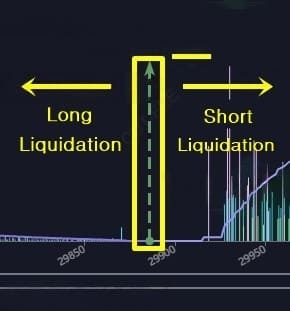
The bar graphs visible on the right side of the short positions represent the liquidation volumes. The taller the bar, the larger the amount being liquidated.
3. Left Vertical Axis
The left vertical axis represents the height of the liquidation bars in USDT. For example, in the image, the tallest bar indicates a liquidation volume of approximately $3,000,000.
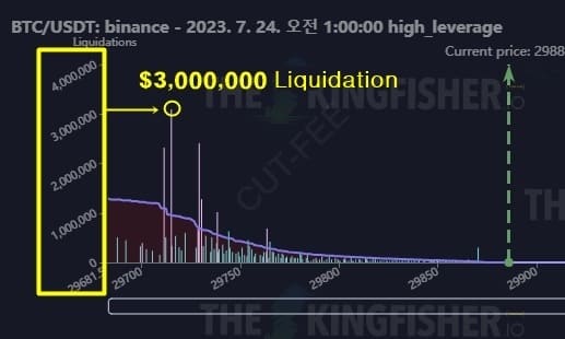
4. Right Vertical Axis
The right vertical axis indicates the height of the purple line shown in the image. This represents the cumulative liquidation volume. Here, “cumulative” refers to the sum of the heights of each individual bar graph.
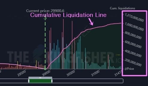
Coinglass Liquidation Map
2. Current Price Bar
This represents the current price of Bitcoin.
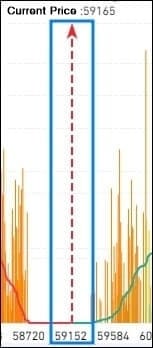
3. Left Vertical Axis
This shows the height of the bar graphs representing the liquidation volumes of long or short positions.
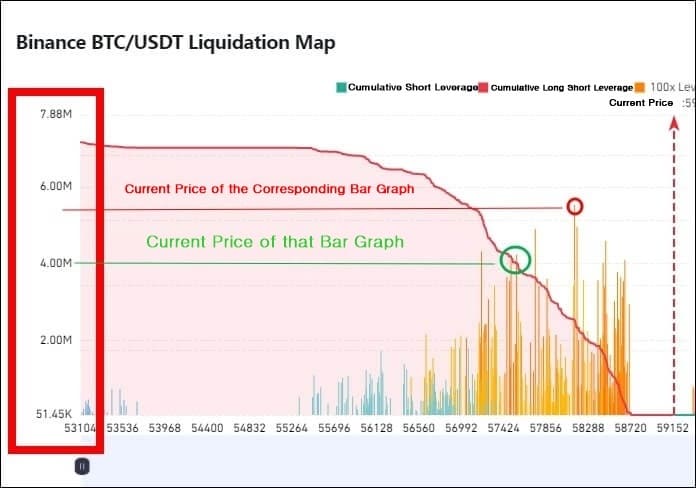
4. Right Vertical Axis
This represents the cumulative liquidation volume for long or short positions.
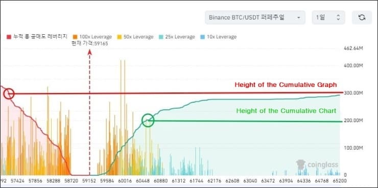
Liquidation Map Trading Strategies
1. Squeezing Scalping Strategy
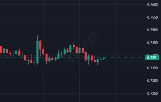
Looking at the high-leverage liquidation map below, if the price drops to $0.7385, a significant amount of long positions—approximately $120,000,000—is expected to be liquidated in a single event.

If XRP drops to this price level ($0.7385), those long positions will be liquidated, forcing their holdings to be sold on the market, similar to a reverse trade.
When that happens, as shown in the image below, there is a very high probability of further decline proportional to the amount of liquidated positions.
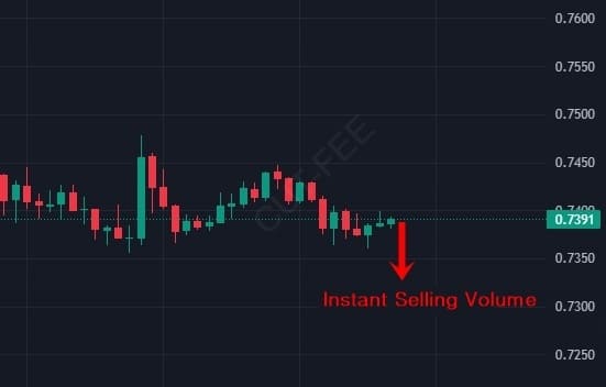
Therefore, when the price reaches these key levels, you can take short positions to target the squeeze liquidations as a scalping opportunity. The larger the liquidation volume—especially if it exceeds $120,000,000—the more effective this strategy can be.
However, if there are movements attempting to prevent liquidation right before it happens, the liquidation bars may shift left or right, so it’s important to monitor them carefully.
2. Stop-Loss Price Reference Setting
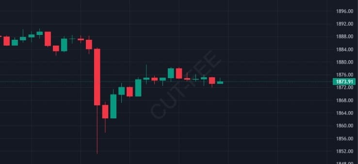
Assuming you currently hold a long position, the liquidation map below shows that a large volume of long positions will be liquidated around $1,863.

As time passes, if the price actually drops to around $1,863, forced selling from liquidations may occur along with a squeeze, increasing the likelihood of a further decline. Therefore, when setting a stop-loss level, placing it slightly above that point—around $1,865—can help prevent additional losses caused by further price drops.
How to Read the Bitcoin Liquidation Map
1. Coinglass
The Coinglass liquidation map can be viewed for free at the link below.
Reference Link: Coinglass Liquidation Map
2. The Kingfisher
The downside of The Kingfisher liquidation map is that its subscription fee is expensive. However, its reliability is high.
Reference Link: The Kingfisher Website
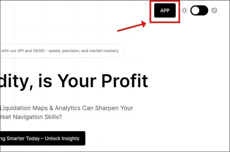
Go to the website and click the “APP” button at the top right corner.
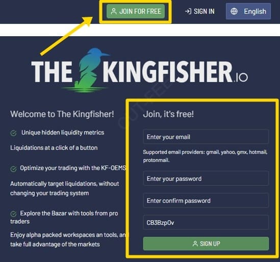
Click the “Join For Free” button, then enter your email and password to sign up. After that, click “Sign In” to log in to your account.
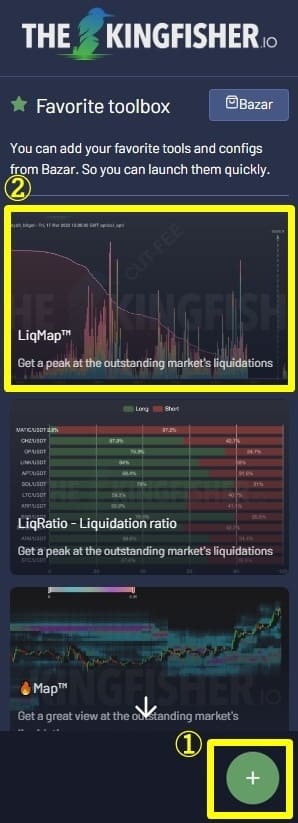
Let’s continue. Click the “+” button at the bottom right of the website, then select the image labeled “LiqMap.”
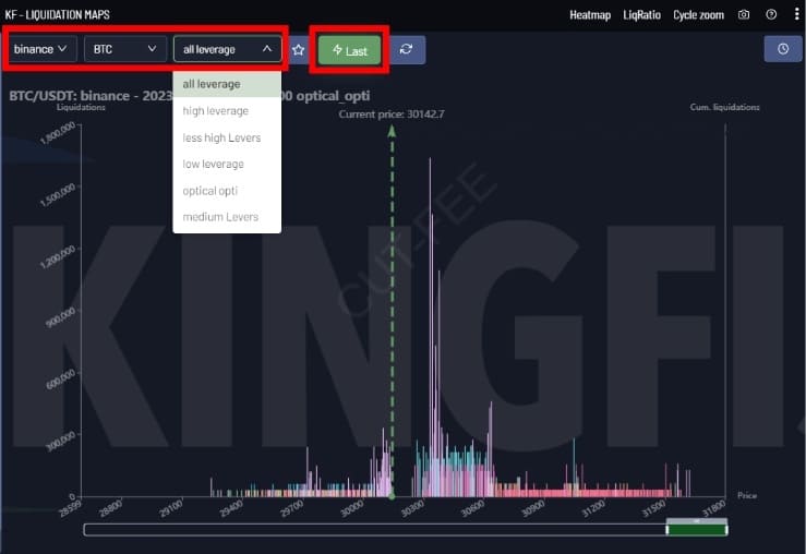
Then, as shown in the image below, the liquidation map will be added. Now select the exchange, coin type, and leverage, and click the “Last” button to generate the liquidation map. If you have a paid subscription, it will generate automatically; otherwise, one credit will be deducted when it’s issued.
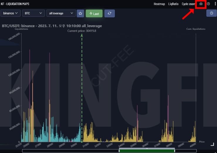
If it’s generated successfully, a map like the one below will appear. You can also save it by clicking the camera icon at the top right corner.
Sign-Up Benefits:
20% off spot trading fees
10% off futures trading fees
Up to $600 in welcome coupons
Tags -
Posts Tagged with Binance
How to read Bitcoin liquidation maps and where to view them for free.
Cut-Fee
We provide a wide range of information related to cryptocurrencies, including exchange introductions and sign-up guides, as well as detailed instructions on how to use exchanges such as Binance, OKX, Bybit, and Bitget, covering registration, deposits and withdrawals, and trading methods.
View All Categories
Notice
Facebook | Twitter


Recent Comments